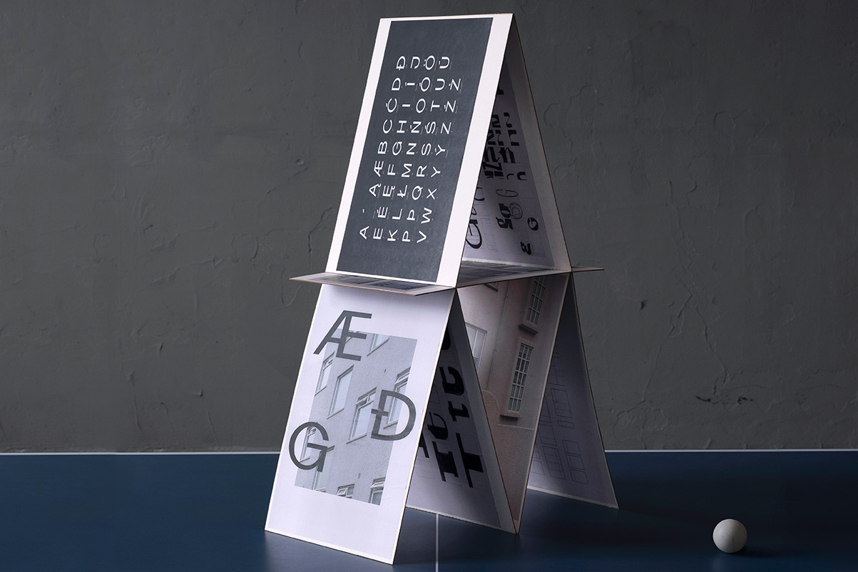
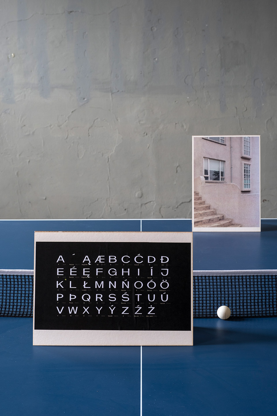
Font Reykjavík
- Designer: Maria Horowska
- Project advisors: Honza Zamojski, Paweł Starzec
- Materials: printed and hand glued elements
Graduation project
Font Reykjavík
Inspired by modernist residential architecture in Reykjavík from 1920-1950, the font consists of uppercase letters with Polish and Icelandic diacritics.
The 20th century in Iceland was a time of tremendous changes — social, industrial, and cultural. One of them, significant for the appearance of Icelandic cities, was the introduction of the modernist style in architecture. All the districts surrounding the center of Reykjavik were built between 1920 and 1950 and are a consistent implementation of the urbanistic ideas of the city.
The font was designed based on visual inspiration and an analysis of the history and architectural principles of modernist design. The goal was to create a model typeface - uppercase along with Polish and Icelandic diacritics — that would visually correspond to the architecture and be a carrier of the history of Iceland's modernist housing estates.
Designer
Maria Horowska
Specialization: Communication Design
Graduation year: 2021